Information Architecture · Mobile App · Product StrategyMaking insurance make sense: rebuilding the app's information architecture
Rebuilding navigation around how drivers actually think.
Overview
When we rebranded Justos, we deliberately deferred the structural work to then do it properly. With all new features since its launching, the app's navigation did not reflect its users' mental models: rewards, driving behavior, policy details, and claims were scattered across surfaces that made sense internally and nowhere else.
In a product people already barely want to think about, every extra step of translation costs trust. I led the restructure: research, IA redesign, flow validation, and rollout with engineering
Design & Product Lead (end-to-end ownership)
❋ Role❋ TeamEngineering, Design team support for brainstorm
❋ TimelineTwo-phase rollout across ~6 months
Actions
❋ Started from mental models, not screens.
Behavioral clustering and interviews from the rebrand research showed how our best users actually thought about the product: "my insurance" (am I covered, what do I pay, what happens if…) and "my points" (how I drive, what I earn back). Two mental buckets — so the app became two.
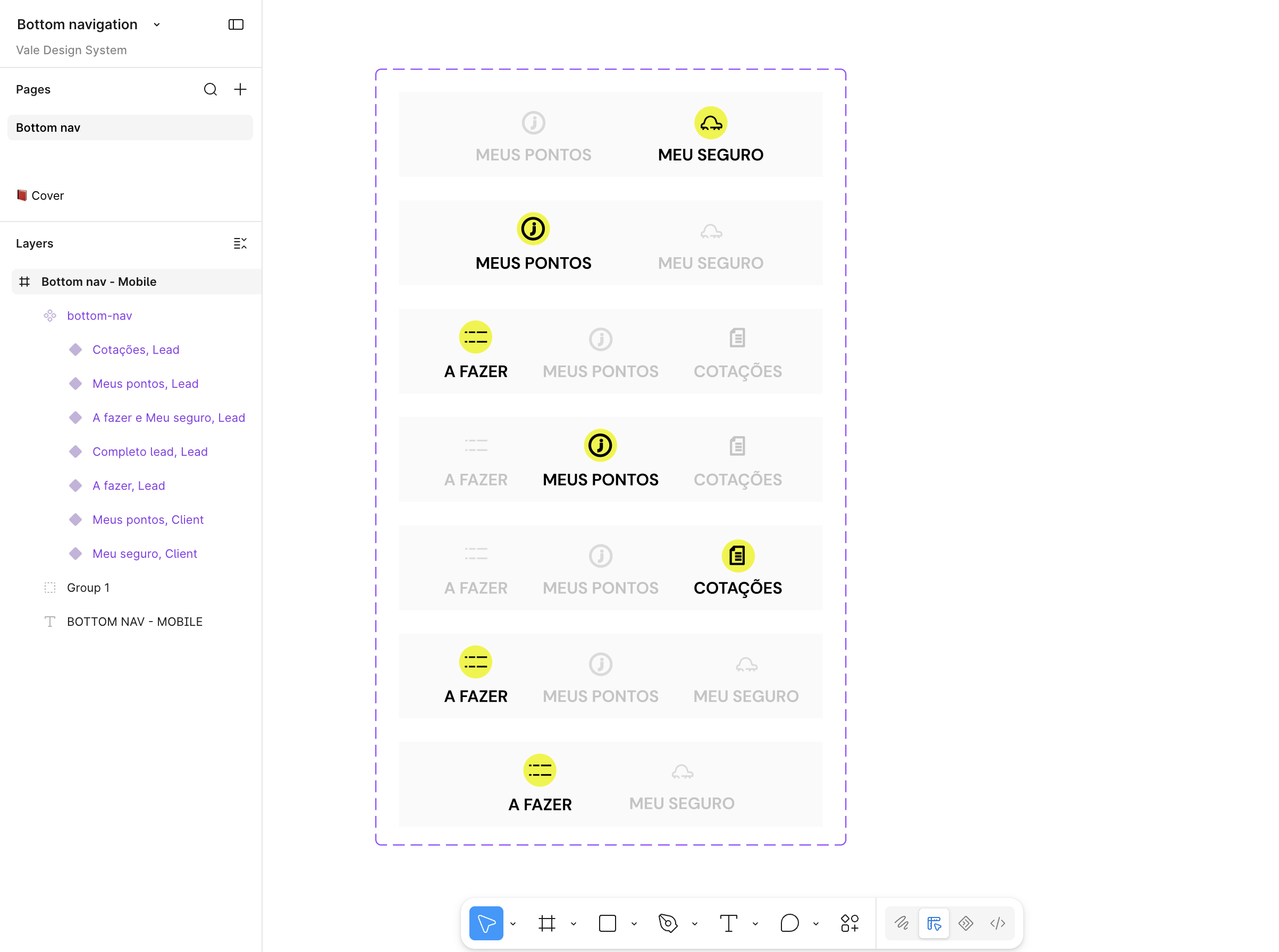
User without policy
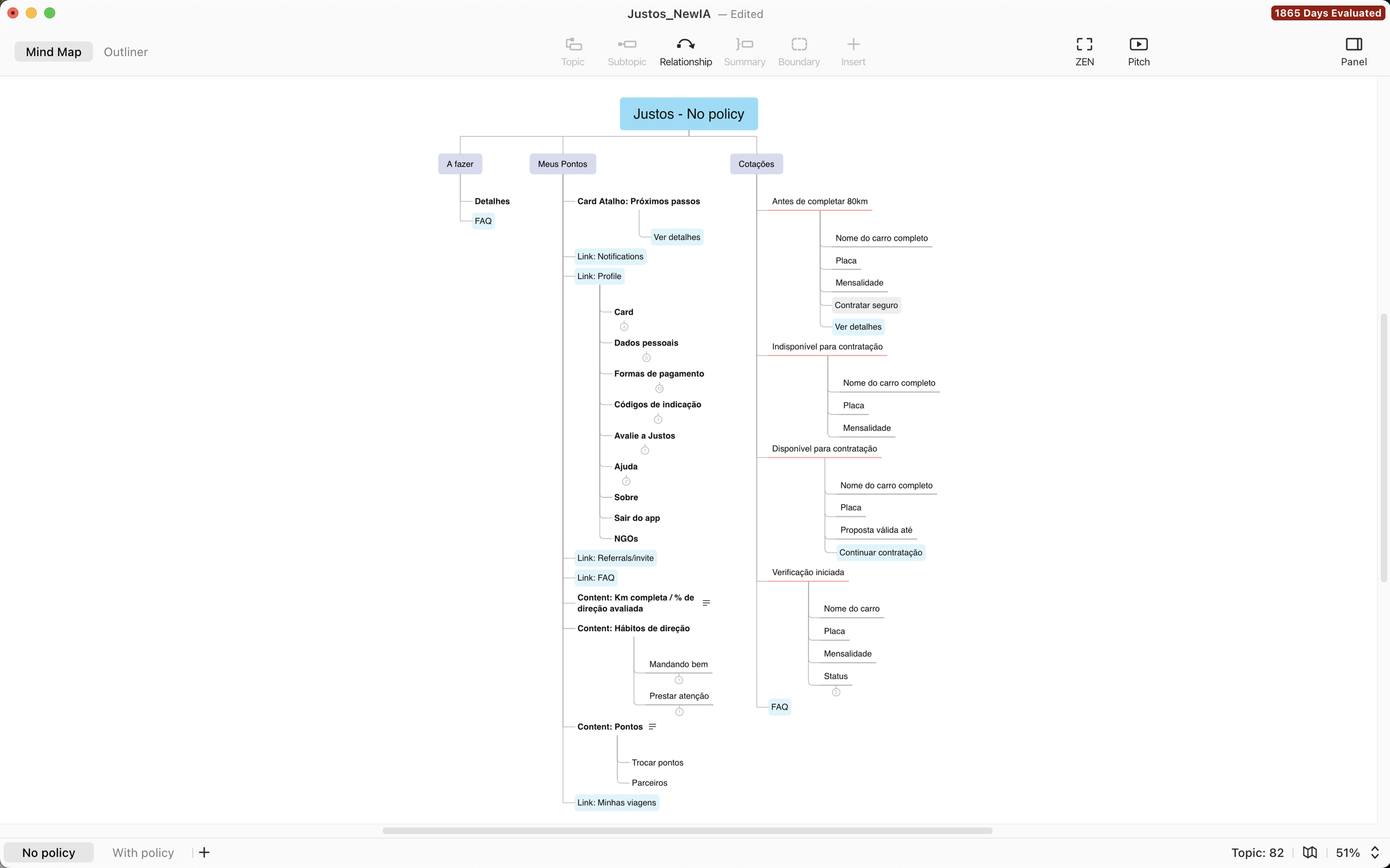
Before there's a policy, the job is different: get to a quote fast, while still surfacing the points and driving habits already accumulating — value waiting to be claimed the moment they convert.
User with policy
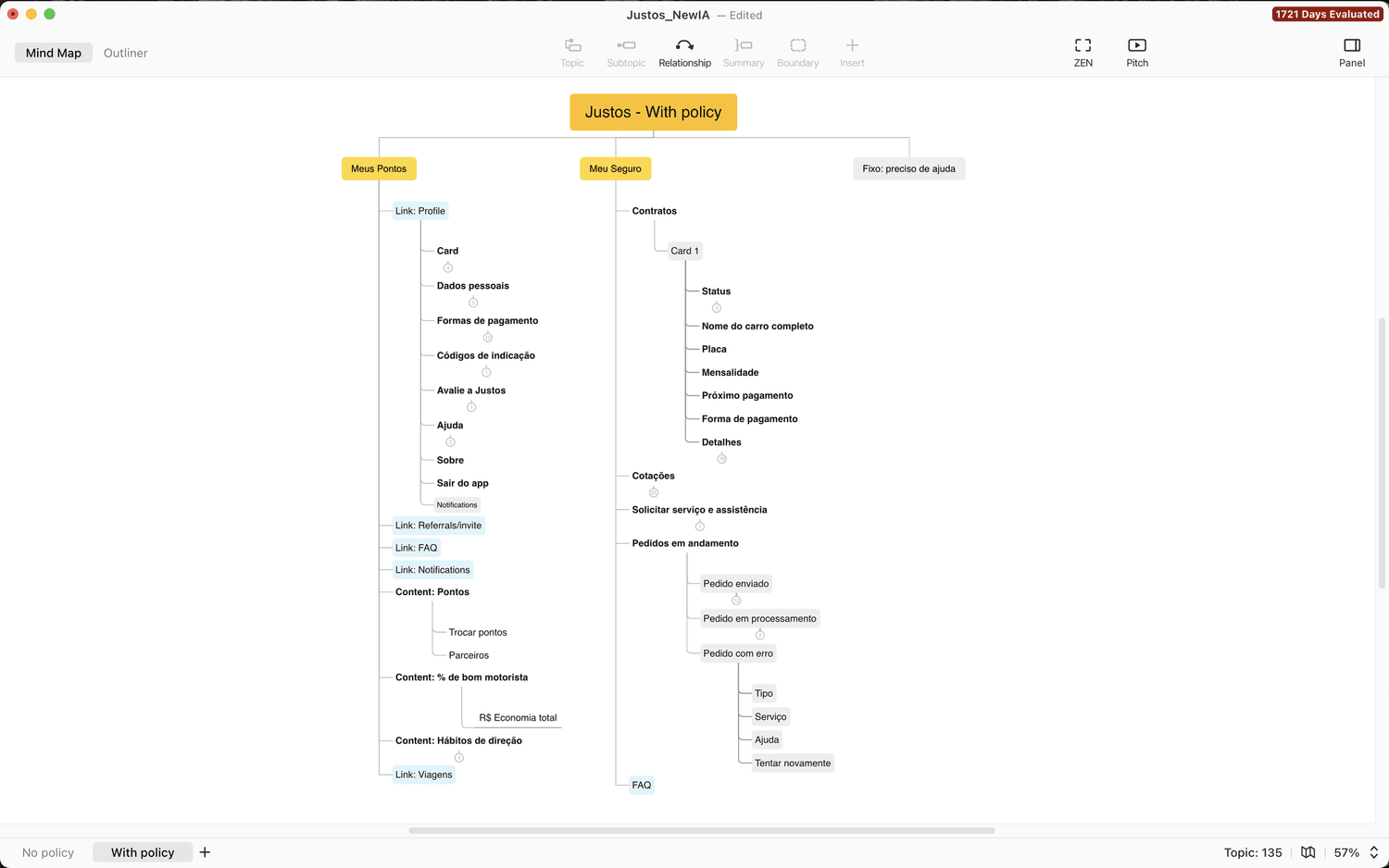
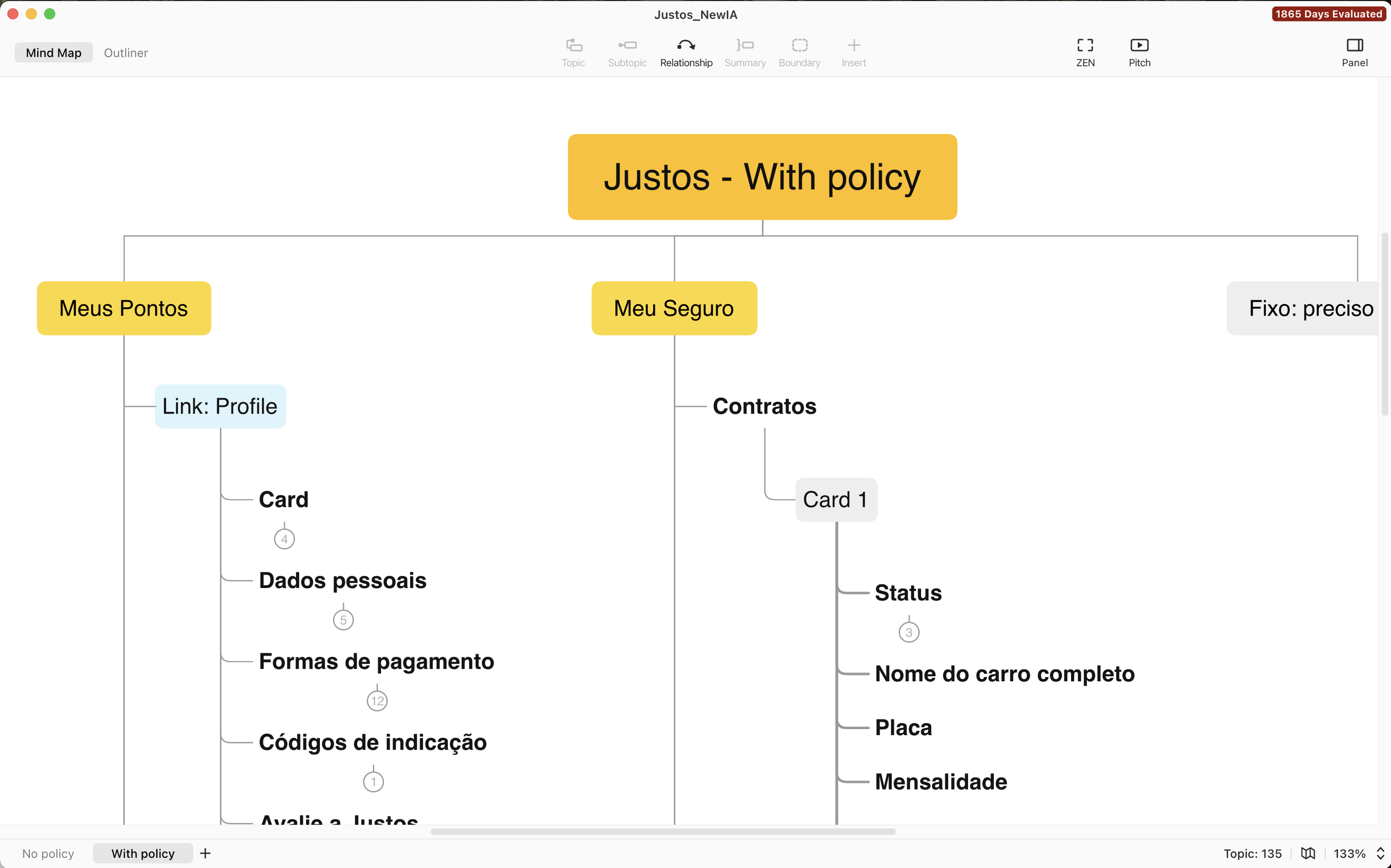
Once there's a policy, the whole app collapses into two pillars — Meus Pontos and Meu Seguro. Redeeming a reward or opening a claim, the two flows that matter most, are both three clicks away or fewer.
❋ Consolidated the architecture around user intent.
Everything about driving behavior and rewards unified under Meus Pontos; everything policy-related under Meu Seguro. Navigation stopped asking users to learn our categories and started matching theirs.
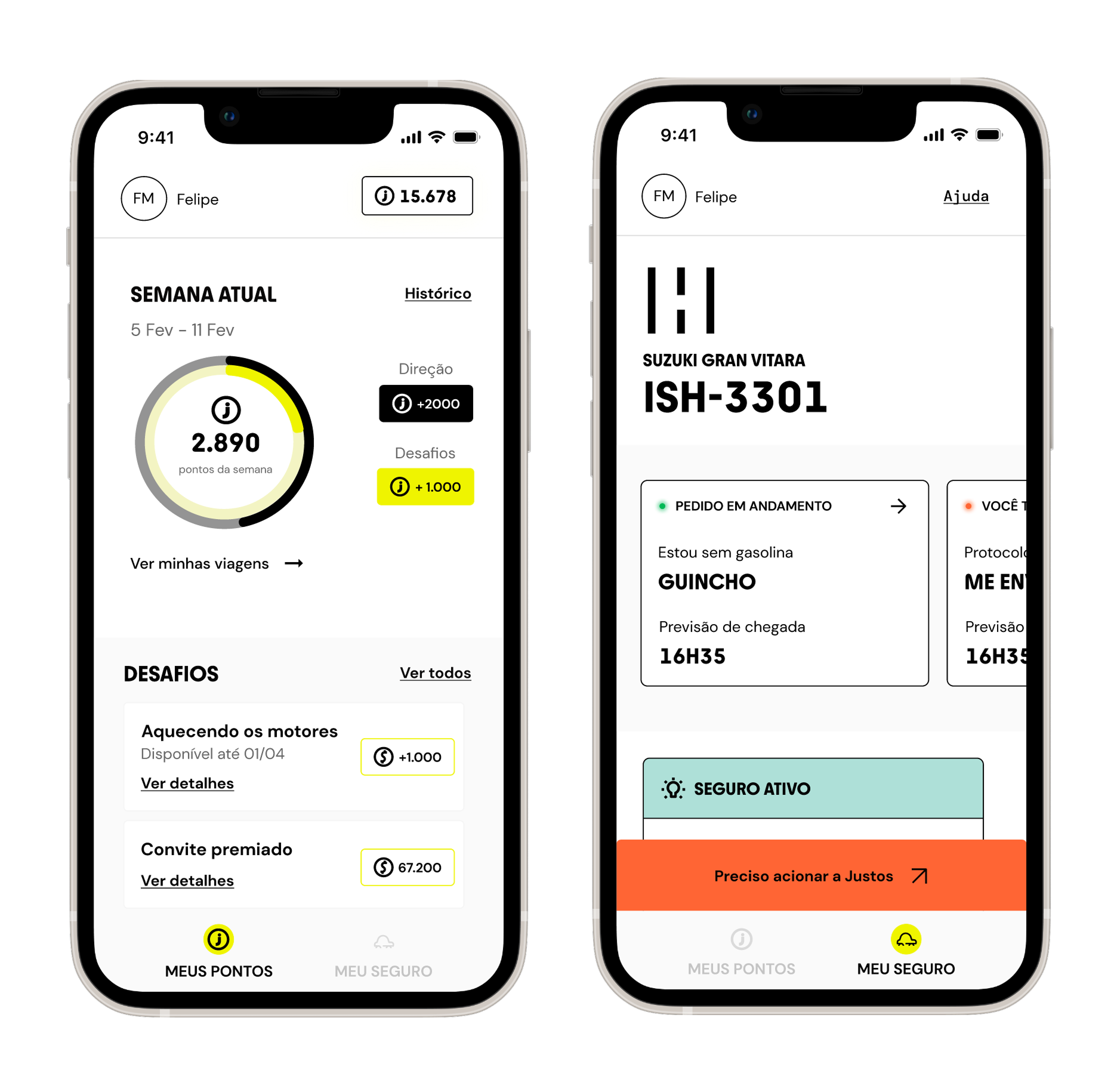
❋ Validation before committing engineering.
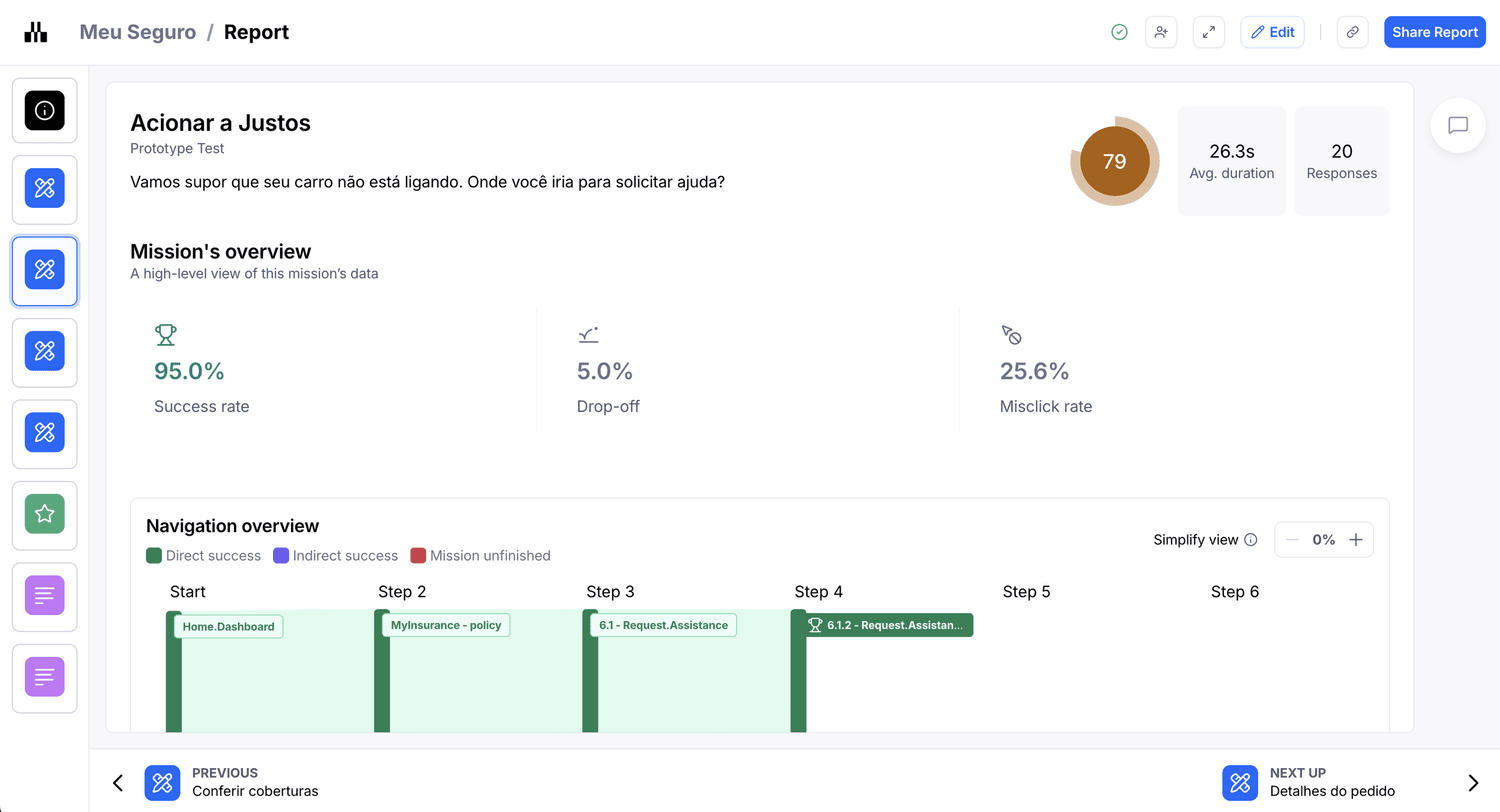
New flows were tested on Maze and checked against real usage patterns in UXCam before build — in a product this regulated and with this level of sensibility for users in need, shipping the wrong structure is not an option.
❋ Promoted Rewards from experiment to core.
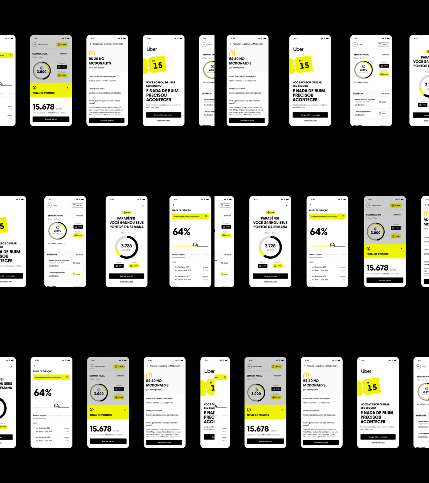
The restructure was the moment Rewards stopped being a feature and became one of the app's two pillars (full case →).
Reflection
IA is where design is most invisible and most structural. Nobody screenshots a navigation model, but every screen we shipped afterwards was cheaper, clearer, and faster to build because the structure finally matched how people think.